

Introduction
A web development logo is much more than a simple graphic. It represents the identity of a web development company, freelance developer, software agency, or digital business. Whether you are launching a new website, offering coding services, or building a technology startup, a memorable logo helps establish trust and professionalism from the very beginning. Since most customers interact with businesses online, your logo often becomes the first visual element they notice.
For beginners, understanding the importance of a web development logo is the first step toward creating a recognizable brand. A well-designed logo communicates your values, technical expertise, and creativity without using many words. It can appear on websites, business cards, social media platforms, mobile applications, email signatures, and marketing materials, helping customers remember your business over time.
Designing a logo does not always require advanced graphic design skills. By understanding branding principles, selecting suitable colors, choosing readable typography, and using meaningful symbols, anyone can create a professional-looking logo. This guide explains everything beginners need to know about creating an effective web development logo, including its purpose, benefits, design process, common mistakes, and practical tips that can improve the overall branding experience.
What is a Web Development Logo?
A web development logo is a visual symbol that represents a web development business, coding agency, freelance developer, or digital technology brand. It combines design elements such as icons, typography, colors, and shapes to create a unique identity that distinguishes one business from another. A logo serves as the face of a company and creates a lasting impression on potential clients.
Unlike decorative graphics, a web development logo is designed with branding in mind. It should reflect professionalism, innovation, reliability, and technical expertise. Many modern logos use clean lines, minimal icons, geometric shapes, code brackets, browsers, or abstract symbols that represent technology while remaining simple enough to be recognized across different platforms and screen sizes.
Why is a Web Development Logo Important?
A professional web development logo helps build trust before customers even explore your website or services. People naturally associate polished branding with quality, reliability, and experience. Even if your business is new, an attractive logo can create a positive first impression that encourages visitors to learn more about your offerings.
A recognizable logo also improves brand consistency. When the same design appears across websites, social media profiles, invoices, presentations, and promotional materials, customers begin to remember your business more easily. Strong visual branding contributes to customer recognition, increases credibility, and supports long-term business growth in a competitive digital market.
Step-by-Step Guide to Creating a Web Development Logo
Step 1: Define Your Brand Identity
Before designing a logo, understand what your business represents. Ask yourself what services you provide, who your target audience is, and what values you want your brand to communicate. Your answers will guide every design decision.
A web development company focusing on corporate websites may choose a professional appearance, while a creative agency might prefer bold colors and modern typography.
Step 2: Research Competitors
Study logos used by successful web development companies and digital agencies. Notice common design trends, typography styles, and color combinations without copying them.
Competitive research helps you identify industry standards while inspiring unique ideas that differentiate your brand from others.
Step 3: Choose the Right Logo Style
Sharpner: A Complete Beginner’s Guide to Types, Uses, Benefits, and Best Practices
IT Companies in Pune: Complete Beginner’s Guide to India’s IT Hub
Cyber Security Job: Complete Beginner’s Guide to Building a Successful Career
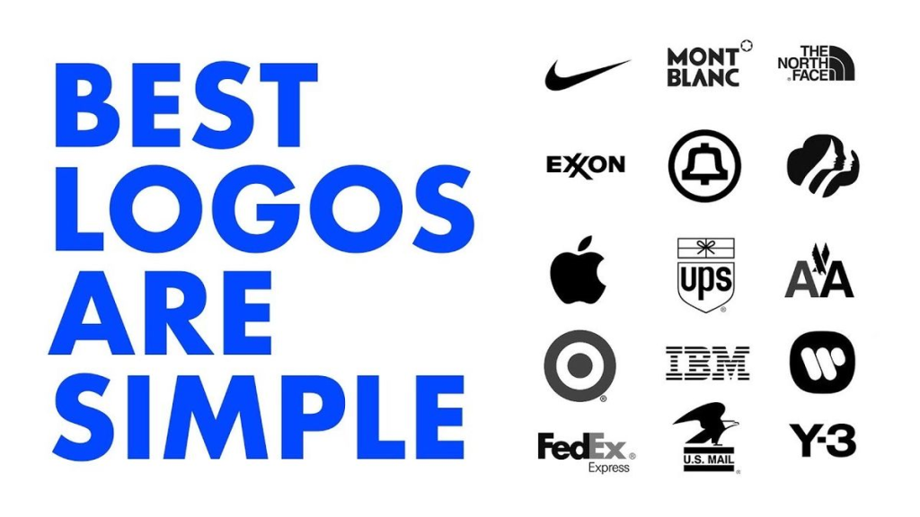
Different logo styles serve different branding goals. Popular choices include wordmarks, lettermarks, combination logos, abstract symbols, and minimalist icons.
Select a style that matches your business personality while remaining easy to recognize across multiple platforms.
Step 4: Pick Professional Colors
Colors influence emotions and customer perception. Technology businesses often choose blue because it represents trust and reliability. Black suggests professionalism, while green reflects innovation and growth.
Limit your palette to two or three complementary colors to maintain a clean and memorable appearance.
Step 5: Select Readable Typography
Typography is one of the most important parts of a web development logo. Modern sans-serif fonts usually work well because they appear clean, professional, and highly readable.
Avoid decorative fonts that become difficult to read on smaller screens or printed materials.
Step 6: Use Meaningful Icons
Icons should support your brand instead of distracting from it. Popular web development symbols include code brackets, browser windows, monitors, pixels, servers, cloud graphics, and abstract technology-inspired shapes.
Simple icons are often more memorable than complex illustrations.
Step 7: Keep the Design Simple
Minimalism remains one of the strongest principles in logo design. Simple logos are easier to recognize, scale effectively, and maintain clarity across different devices.
Avoid unnecessary effects, excessive gradients, or overcrowded layouts that reduce readability.
Step 8: Test Different Sizes
A logo should look equally impressive on a website favicon, social media profile, mobile app, presentation, and billboard.
Resize your design several times to ensure every detail remains visible without losing quality.
Step 9: Gather Feedback
Before finalizing your logo, ask colleagues, friends, or potential customers for honest opinions. Fresh perspectives often identify improvements that designers may overlook.
Constructive feedback helps create a logo that appeals to a broader audience.
Step 10: Create Multiple File Formats
Nudi Software: An Important Tool for Kannada Typing and Digital Communication
LabSmart Software: Smart Management for Pathology Labs!
Cyber Security Diagram: A Complete Beginner’s Guide to Understanding Network Security
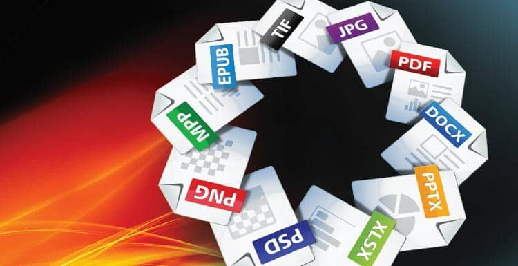
Export your finished logo in PNG, SVG, PDF, and JPEG formats. Vector files allow unlimited resizing without losing image quality.
Having multiple versions ensures compatibility across websites, marketing materials, presentations, and print products.
Benefits of a Web Development Logo
- Creates a professional first impression
- Strengthens brand identity
- Builds customer trust
- Improves business recognition
- Supports long-term marketing efforts
- Makes websites look more credible
- Enhances social media branding
- Helps customers remember your business
- Differentiates your company from competitors
- Works across digital and print platforms
- Increases perceived business value
- Supports consistent visual communication
Disadvantages / Risks
- Poor design can damage brand credibility
- Overly complex logos become difficult to recognize
- Trend-based designs may quickly become outdated
- Frequent logo changes confuse customers
- Low-quality graphics appear unprofessional
- Similar logos may reduce brand uniqueness
- Incorrect color choices can weaken brand identity
- Small details may disappear on mobile devices
Common Mistakes to Avoid
One common mistake is making the logo overly complicated. Beginners often add too many icons, colors, gradients, or decorative elements that reduce clarity. A simple logo is easier to recognize, remember, and reproduce across different media.
Another mistake is copying existing logos or relying too heavily on current design trends. Originality is essential for building a unique brand identity. Designers should also avoid unreadable fonts, poor spacing, inconsistent colors, and low-resolution graphics. Testing the logo on different backgrounds and screen sizes before launching ensures it performs well in every situation.
FAQs
1. What makes a good web development logo?
A good web development logo is simple, memorable, scalable, and relevant to the brand. It communicates professionalism while remaining easy to recognize on both digital and printed materials.
2. Which colors work best for a web development logo?
Blue, black, gray, green, and purple are commonly used because they represent trust, technology, innovation, and professionalism. The best choice depends on your brand personality.
3. Can beginners create a professional logo?
Yes. Beginners can create professional logos by following branding principles, choosing simple designs, selecting readable typography, and maintaining consistency throughout the design process.
4. Should a web development logo include coding symbols?
Not necessarily. While code brackets and technology icons are popular, abstract symbols or creative typography can also create a strong brand identity without directly representing programming.
5. Why is scalability important in logo design?
A scalable logo remains clear whether displayed as a small website icon or a large banner. Vector graphics ensure quality at every size without losing sharpness.
6. How often should a business redesign its logo?
A logo should only be redesigned when necessary, such as during a major rebranding or when the current design no longer represents the company’s identity. Frequent changes may confuse existing customers.
Expert Tips & Bonus Points
Focus on timeless design instead of temporary trends. A clean and balanced logo will remain effective for many years, reducing the need for expensive redesigns. Consistent branding across your website, social media, business documents, and promotional materials increases recognition and customer confidence.
Create logo variations for different backgrounds, including light, dark, monochrome, and transparent versions. Maintain sufficient spacing around the logo to improve visibility and never stretch or distort the design. Saving the original editable files allows future updates without recreating the entire logo from scratch.
Conclusion
A web development logo is one of the most valuable assets for building a successful digital brand. It represents your business identity, communicates professionalism, and helps customers recognize your services across multiple platforms. While creating an effective logo may seem challenging for beginners, following basic design principles makes the process much easier. Simplicity, readability, appropriate colors, meaningful symbols, and consistency are the foundations of successful logo design.
As your business grows, your logo becomes a visual representation of your reputation and expertise. Investing time in thoughtful planning and careful design can improve customer trust, strengthen marketing efforts, and create a memorable brand presence. Whether you are a freelance web developer, a startup founder, or a growing digital agency, a well-crafted web development logo contributes to long-term success. By avoiding common mistakes, gathering feedback, and maintaining consistent branding, you can develop a logo that reflects your vision while leaving a positive impression on every visitor and potential client.
KSB Tech Explained: Features, Services, and Benefits
Umesh Tech Support: Your Complete Guide to Reliable Technical Assistance
Web Development Icon: A Complete Beginner’s Guide to Design, Use, and Best Practices
SAP Software Download: Complete Guide to Installation, Features, Benefits, and System Requirements
